Personal Area Redesign
Turning a static account page into a value hub that drives engagement, subscriptions and basket size

Company
Role
Platforms
Ocado Technology
Context
Problem
For users
Few reasons to come back
Savings, benefits and subscriptions were hard to find
Outdated order views and basic account settings
For the business
Missed revenue from Delivery Pass and loyalty
Low re-engagement on a high-intent surface
Users unaware of savings, so lower basket value
My role
Led end-to-end design of the Personal Area, from discovery to validated concept
Ran competitive benchmarking and analysed top user actions
Facilitated a workshop to align on product pillars
Designed a modular dashboard for iOS and Android
Validated the concept with usability testing, click testing and a heuristic review
Collaborated with Product, Data, Research and Customer Support
Discovery
Competitive benchmarking: Amazon, Uber and Instacart all use action-driven dashboards
Behavioural analysis: identified patterns and the top user actions
Cross-functional workshop: aligned on four pillars: savings, control, personalisation and reordering
Key insight
Users don't open their account to manage settings. They come to act, and they stay when they see value.
Approach
User goals
Edit orders and reorder quickly
Access savings and subscriptions
Business goals
Increase Delivery Pass conversion
Grow loyalty participation
Promote coupons and recurring orders





Solution
Before
Fragmented orders, loyalty and account settings, with no clear priority or visible value.


After
A value-driven hub that surfaces savings, prioritises key actions, and drives repeat engagement and subscriptions.


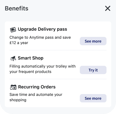


A redesigned Personal Area built as a value-driven dashboard:
Immediate value
Engagement drivers
Benefits (Delivery Pass, Smart Shop, recurring orders)
Loyalty and coupons surfaced clearly
Action layer
Secondary layer
Preferences and support
Validation
What this suggests: making value visible drives engagement. The next step is to prove the business impact in a live A/B test.
How success would be measured
Delivery Pass conversion
Loyalty engagement rate
Average basket size
Reorder frequency
Interaction with savings modules
Learnings
Value before settings. An account page can be a growth surface, not just a utility.
Hierarchy is strategy. The order of modules reflects business and user priorities.
Modular design enables testing. Each module can be measured and reordered independently.
Next steps
A/B test the new dashboard against the current version
Personalise the order of modules
Test how value is framed: money saved vs convenience
Measure the impact on basket size and subscription uptake