Scalable Design System
Building a design system from zero to one to bring consistency and speed across Screening Eagle's B2B SaaS products
COMPANY
ROLE
PLATFORMS
Context
Screening Eagle builds a B2B SaaS platform that helps engineers assess buildings and infrastructure through digital inspection, sensor data and asset management.
Its ecosystem includes complex digital workflows and specialised tools, making consistency and scalability particularly important across its products.
Problem
There was no design system. As the products grew, every new screen was designed from scratch. The result:
Inconsistent interfaces across products
Repeated work for designers and engineers
No shared language between design and development
My role
Led the design system from zero to one, across web and iOS
Researched existing patterns and established design systems
Defined foundations, components, states and usage guidelines
Created a governance process for adding new components
Designed the Storybook documentation experience, prototyped in Figma
Partnered with engineers on implementation
Introduced DesignOps practices that improved collaboration and design-to-engineering handoff
Discovery
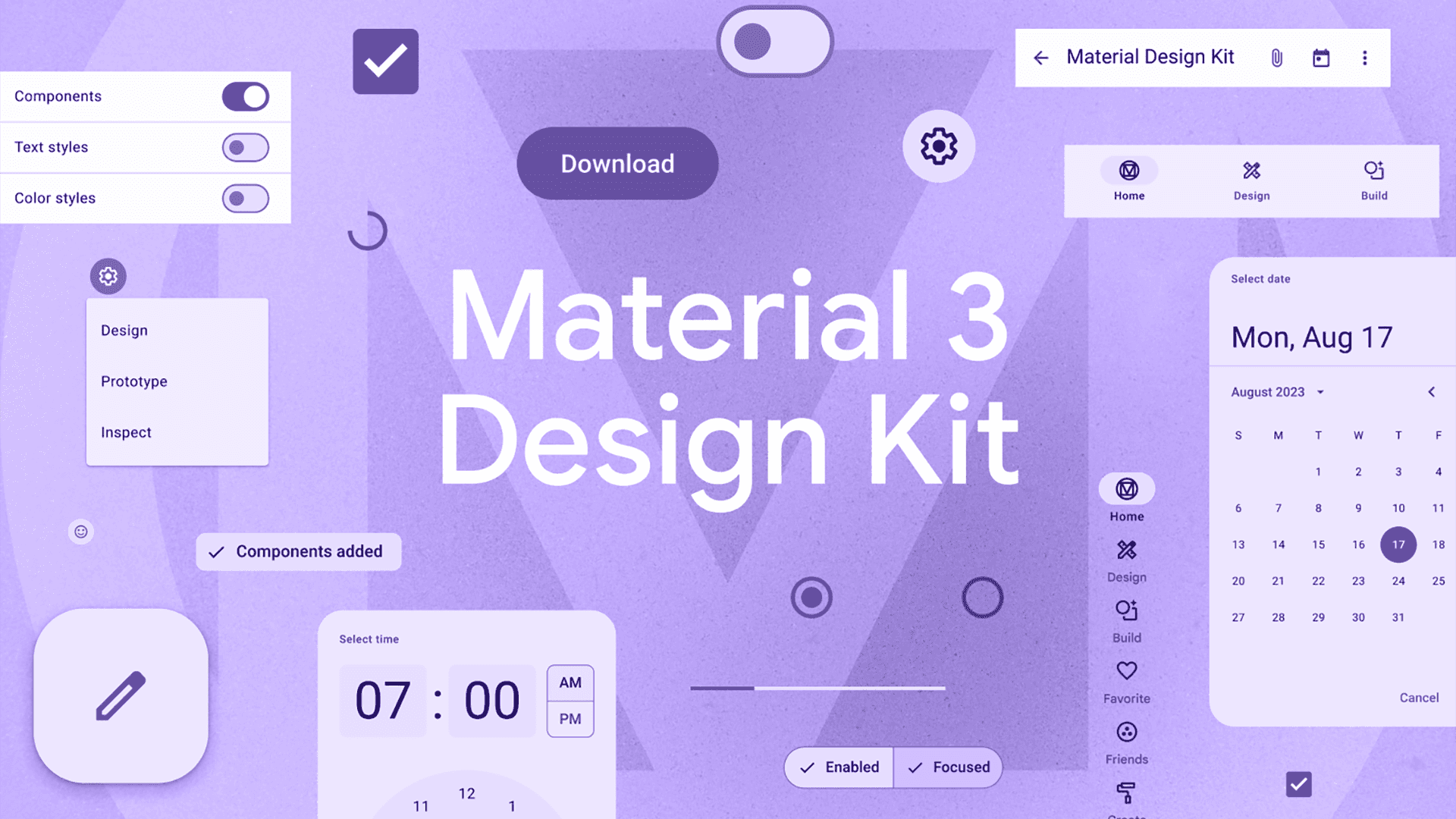
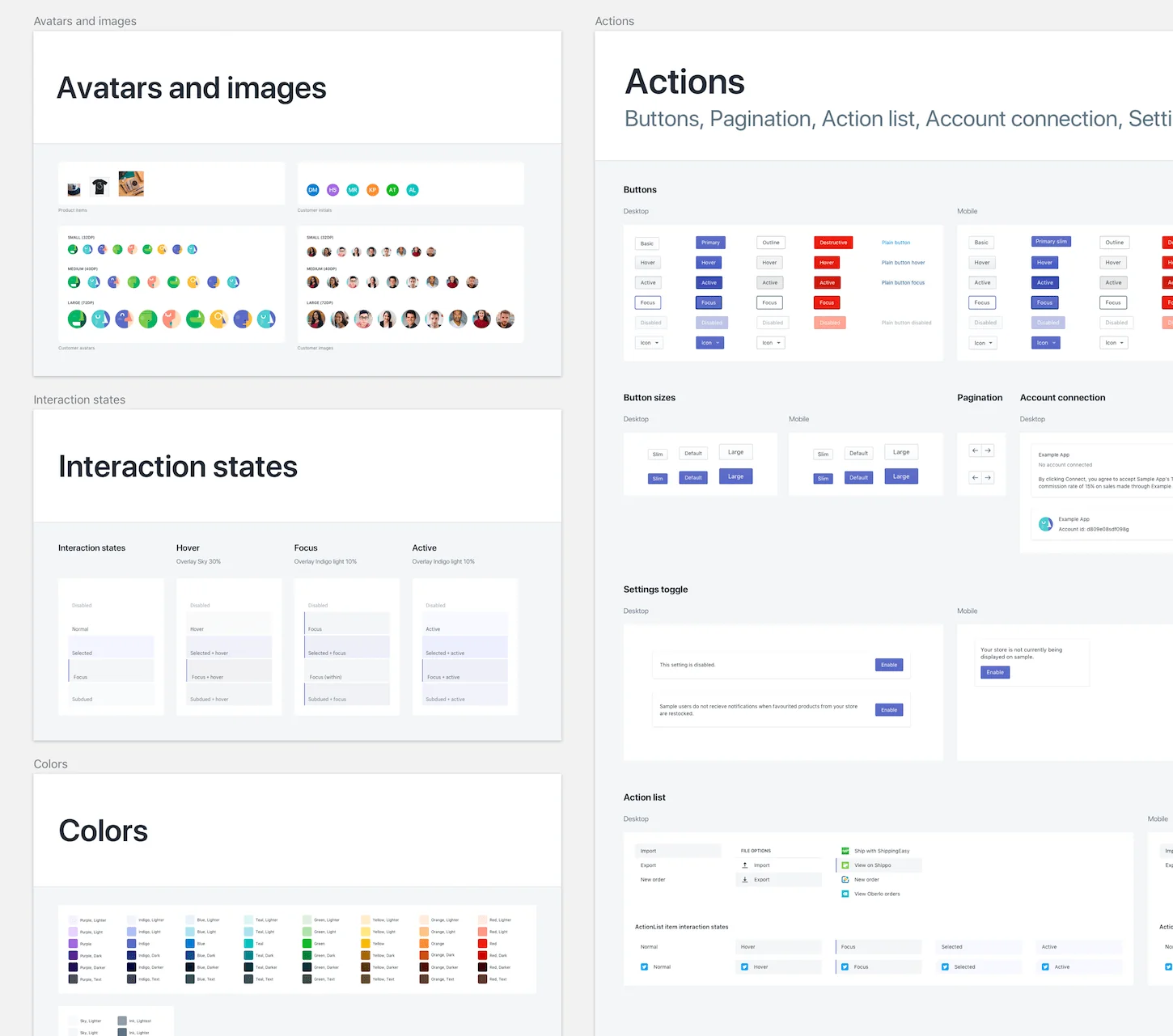
Before designing individual components, I researched existing patterns and studied established design systems to understand how they approached foundations, component structure, states, behaviours and documentation.
Working with designers and engineers, I translated those learnings into a system tailored to Screening Eagle's products and technical requirements.


Approach
Foundations

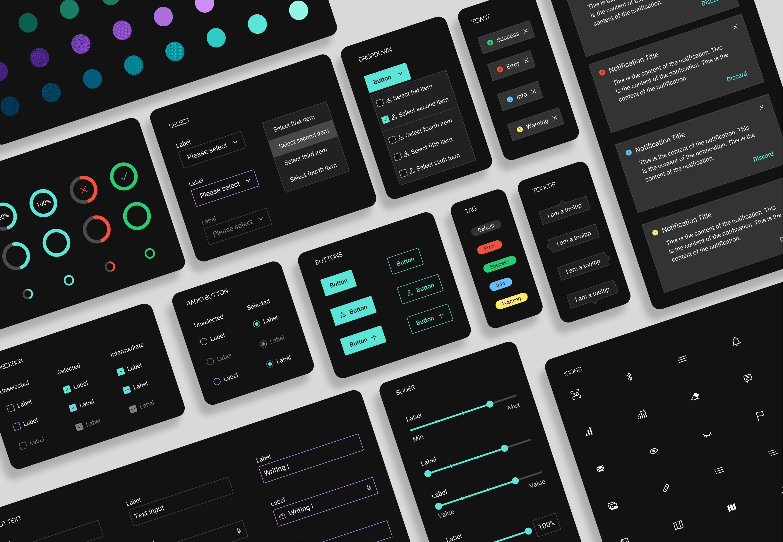
Building the component library
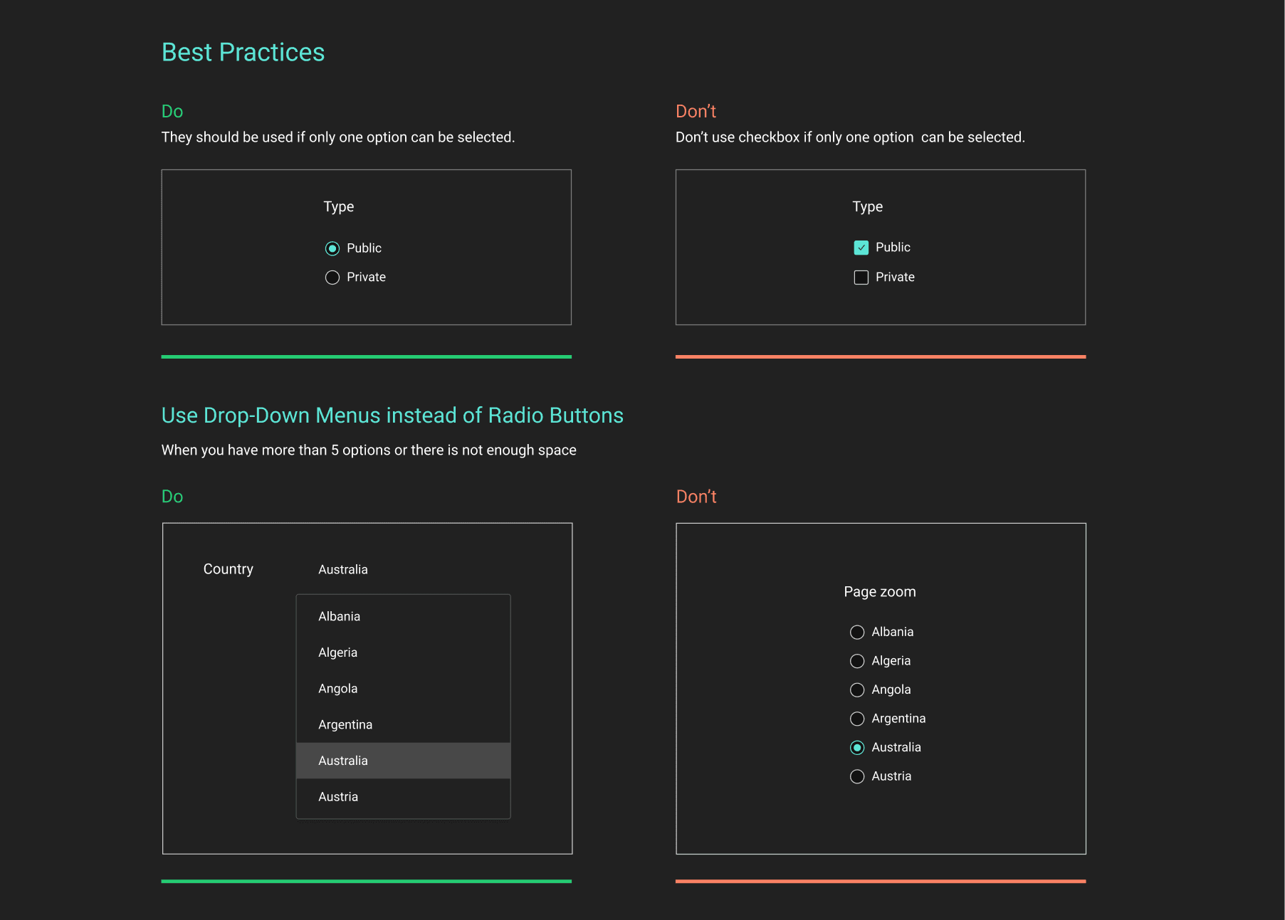
With the foundations established, I created the core component library, defining not only how each component looked, but also its variants, states, behaviours and usage.
The library covered:
Buttons · Spinners · Checkboxes · Radio buttons · Switches · Inputs · Search · Number fields · Text areas · Tooltips · Toasts · Banners · Modals · Sliders · Selects · Dropdowns · Sidebars · Tables · Pagination · Tags · Dividers




Governance: a repeatable process for new components
As the system evolved, I created a repeatable process for introducing new components.
New patterns were evaluated against existing components before being added, helping prevent unnecessary duplication and keeping the system coherent as it grew.
Research → Define → Design → Review → Document → Release

The process ensured that new components were driven by a clear need, validated with the team and fully documented before becoming part of the system.
Solution: One source of truth
A design system only creates value when teams can easily understand and use it.
To make the system accessible beyond individual Figma files, I designed a centralised documentation experience based on Storybook, bringing the complete component library, specifications and usage guidelines together in one place.
I created a high-fidelity Figma prototype that mirrors how the Storybook environment could work, allowing designers and engineers to browse components, explore their states and variants, and access the documentation they need.
The result was a single, structured source of truth for the design system, designed to support both current use and future implementation.
From system to product
The design system was applied to real product experiences, bringing consistency to interfaces while allowing individual products to respond to their specific needs.


Impact
• ~35% faster design production: designers reuse tested components instead of starting from scratch
• 45% less handoff documentation time: specs and usage guidelines live in one place
• 25 to 30% faster feature build: engineers adopted standardised components and patterns
• Consistent experience across Screening Eagle's products
• A process that scales: new components follow the same 6 steps
Learnings
A design system is a product. It needs users, structure, collaboration and continuous iteration.
Documentation drives adoption. Components nobody can find don't get used.
Governance keeps it healthy. A clear process stops the system from growing out of control.