Behelp App
Making volunteering possible, even when you only have a few hours.
Mobile app
Marketplace
User research
Validated
ROLE
TEAM
PLATFORM
TIMELINE
Context
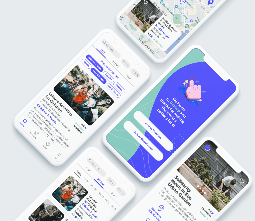
Behelp connects people with short-term community projects that fit their time, interests and location.
After volunteering in projects around the world, I noticed a gap. There was no easy way to find volunteering opportunities for people with only a few hours or days available.
Problem
Volunteering usually needs a long time commitment
There was no dedicated place to discover short-term opportunities
Organisations spent too much time finding and screening reliable volunteers
The first idea focused on travellers. Research showed a bigger opportunity: short-term volunteering for people in their own cities.
My role
Personal project, designed end to end:
User research: surveys, interviews and usability testing
Problem definition and product strategy
Information architecture and task flows
Wireframes, prototyping and visual design
Success metrics for a two-sided marketplace
Discovery
Research
259 surveys with volunteers and organisations across several countries
6 interviews with volunteers and with organisations in Vietnam, Tanzania and Spain


What we learned
Local beats travel. People volunteer more often in their own community than when travelling.
Discovery is missing. There was no place to find short-term opportunities.
Volunteers want to decide alone. They wanted enough information without contacting organisations first.
Organisations lack time. Talking to every potential volunteer took too long.
Reliability is the biggest worry. Organisations feared volunteers not showing up.
One size doesn't fit all. Organisations had very different needs.
One of the strongest insights came from speaking with travellers:
“Travellers don’t think to volunteer for a day as they don’t know this could be an option.”
Mariana, Buenos Aires
These insights shifted the product from a simple volunteering directory into a two-sided platform focused on discovery, trust and reducing friction.
Approach
How might we make it easy for people to find and join short-term social projects that fit their interests, time and location, while helping organisations find volunteers they can trust?
Two connected experiences:
Volunteers
Discover and evaluate opportunities
See activity, time, place and organisation
Apply directly, with no back and forth
Organisations
Create opportunities
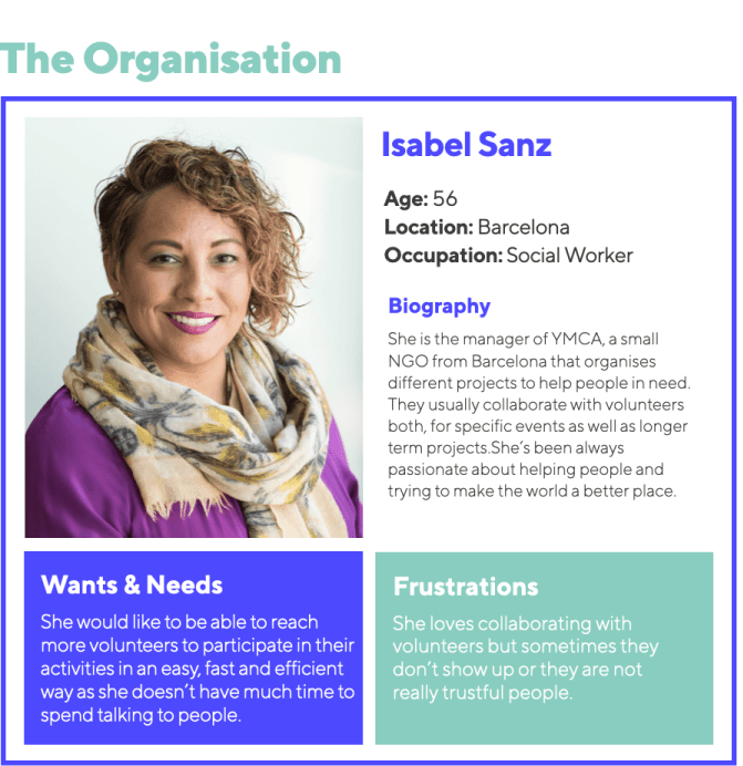
Review volunteer profiles
Accept applications with confidence

Solution
A mobile app that brings discovery, trust and easy participation together:
Short-term opportunities filtered by interest, location and time
Organisation and volunteer profiles to build trust on both sides
Clear project details: what, where, when and what help is needed
Direct application flow with notification
The core loop: Discover → Apply → Review → Accept → Participate
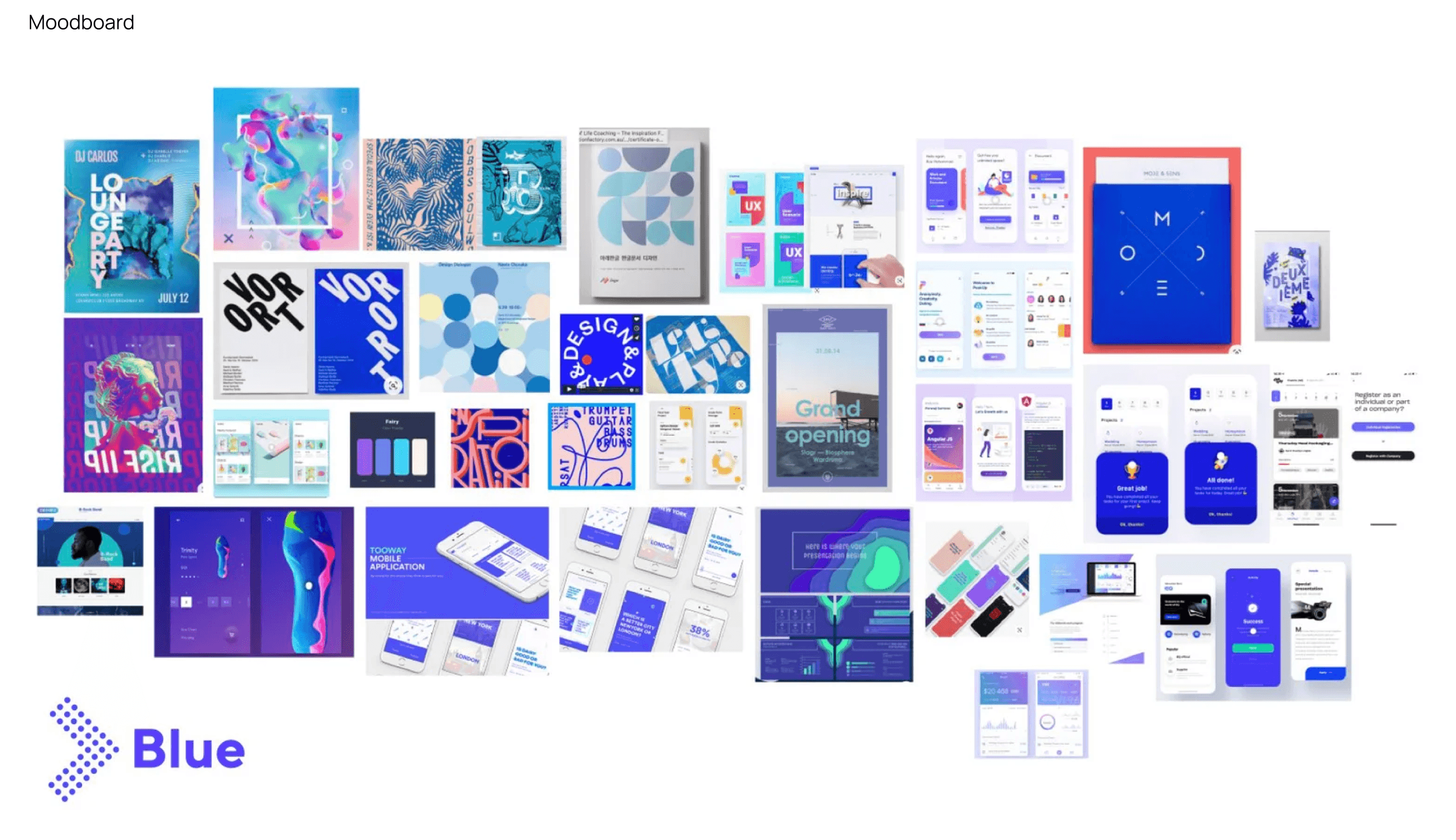
Process: Sketches, task flows, wireframes, information architecture and visual design. I chose a fresh, optimistic visual style with blue as the key colour, to signal trust and openness.




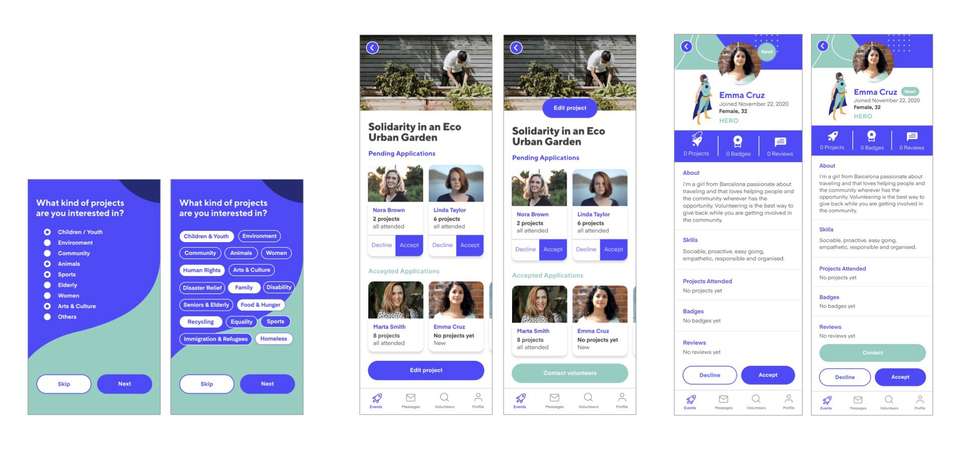
The final experience brings together discovery, trust and effortless participation in one place. Volunteers can explore opportunities based on their interests, location and availability, understand the organisation behind each project, and apply directly through the platform.
Below is a selection of the key screens that bring this experience to life.


Impact: usability testing
I tested the prototype with 7 users across the different journeys.
The testing focused on whether users could:
Discover a relevant volunteering opportunity.
Understand what was required.
Decide whether they trusted the organisation.
Apply without unnecessary communication.
Understand what happened after submitting an application.
The findings informed several iterations to the experience and highlighted areas that would require further development, particularly around filtering, discovery and trust.

What changed after testing
Simpler view switching. Replaced the "List View / Calendar View" toggle with three tabs: List, By day and Map. The map moved from a floating button into the tabs, where users expect it.
Faster discovery. Added quick filters for popular categories, like Children & Youth, Animals or Sports, so users can narrow results in one tap.
Lighter cards. Removed the long description from the results and added a photo carousel, so users can scan more opportunities quickly.
Accessible navigation. Made unselected icons darker, with bolder labels, to improve contrast and readability.
Final Prototype
The first version of the experience gave me a strong foundation to test with users. The usability sessions revealed opportunities to simplify interactions, improve clarity and strengthen the overall experience.
I incorporated these findings into the final prototype, refining the key journeys based on what I learned from testing.
The result was a more focused experience that made it easier for volunteers to discover relevant opportunities, understand the details of a project and complete the application journey with confidence.
Explore the final experience
The prototype brings together the complete volunteer journey, from discovering an opportunity to applying and receiving confirmation.
How I'd measure success
Because Behelp is a two-sided platform, success needs to be measured across both sides of the marketplace.
Learnings
Research changed the product. The opportunity wasn't only for travellers. It was for anyone with limited time.
Find the right problem first. I focused on the real need, not the expected solution.
Trust drives a two-sided marketplace. Profiles and clear information mattered more than features.
Next steps
Better filtering and sorting
Favourites and reviews
Handling volunteers who don't show up
Longer term: membership models, longer projects and community-created activities